Vivien Muller
22 July, 2022
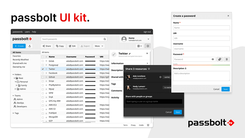
Our design system is now available as a Storybook project. It includes an extendable style guide and reusable React components which can be used as playground by designers and developers.
This newly available UI kit is one more step towards making developers contributions easier with passbolt. It allows any developer to create and test components individually. Because it runs outside the app, project dependencies do not affect the behaviour of the components.
Enough talking. Check it out: https://passbolt.github.io/passbolt_styleguide

What is Storybook?
Storybook is a development environment tool for UI components. Separating the UI components from the rest of the codebase makes development faster and easier.
It can be launched as a standalone project, shared with anyone that needs to work on the UI aspects of the software and it’s awesome.
Storybook is the technology we have chosen at Passbolt to make our User Interface development accessible to everyone.
UI Kit components
Our UI kit is divided into components, organised by low level items first (buttons, fields) and gradually moving to the more complex ones (entire dialogs or screens).
Low level components
You will find the low level components inside the “Foundations” section of the UI Kit. It covers all the building blocks of the app.
All components are included individually along with their associated states, so that it is possible to understand and visualise all the possibilities offered.

An intermediate layer provides basic composed components made of several low level ones as seen above. An example of such components are text fields which combine a label, a field, a description and an optional error message.

The section “Passbolt Components” gathers the ready-to-use high level elements which are used inside passbolt workspaces and features: dialogs, screens, settings, etc.


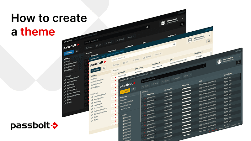
Language and themes are included
Languages and themes that are available in passbolt can also be applied inside the UI Kit so that it is possible to see how components behave in various conditions.

Share your thoughts
We hope you will find it useful and that it will help the community contribute to the UI and build more themes or even propose improvements. An upcoming article will provide a detailed guide about how to build a theme using this UI Kit.
Feel free to share your thoughts on the community forum.
Continue reading
7 min. read
How to create a custom passbolt theme with the UI Kit
With the recent availability of the UI kit, it is now easier than ever to customize your passbolt. We will demonstrate it in this step by step tutorial by explaining how you can create your own custom passbolt theme.
Benjamin
18 August, 2022
2 min. read
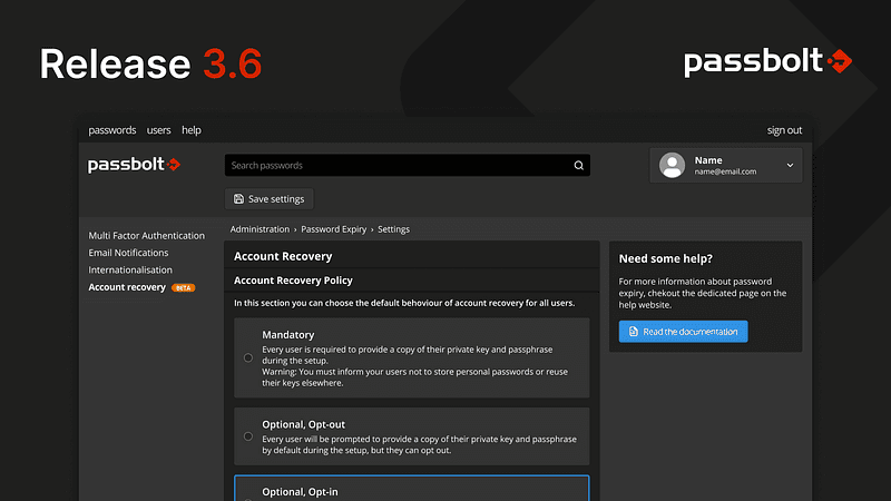
Release 3.6: Account recovery
Frustrated with your users that keep forgetting their passphrase or losing private keys? Chill out, this belongs to the past.
Vivien Muller
18 July, 2022